Design and ship Project Web, an evolution of Project Desktop that meets modern customer needs.
Project Web Timeline
Context
Project is one of Microsoft’s oldest programs, launched over 30 years ago. It’s become a staple tool for project mangers over the decades, with companies using it for everything from event planning to production tracking. However, both Microsoft and the task management space have evolved drastically since Project’s launch. Agile task management is gaining popularity, Microsoft Teams and Office 365 are transforming how teams work together, and user expectations are higher than ever.
Project structure
Three designers (including myself) set out to design a new version of Project for the Web. We worked off of decades of learning and feedback from Project Desktop. I had complete ownership over the timeline view. The project had a four month design phase, leading into a six month execution phase. I worked iteratively with PM + Engineering throughout the process.
Project Desktop pain points
Complicated
Project Desktop makes task management feel super complicated. Customers don’t want to have to take a certification course in order to get started.
Old and Clunky
Dated UX makes Project Desktop feel as old as it is. Lengthy, manual workflows don’t match the modern feel that customers are used to seeing in competitors and other Microsoft O365 products.
Isolated
Project Desktop doesn’t integrate with popular offerings like Teams. Its publishing model is nice in some ways, but doesn’t lend itself to collaboration.
Key persona and main workflows
Experience principles
Modern
The timeline looks clean and professional when customers present it to teammates and stakeholders. Project is a showcase of Microsoft’s new design language.
Interactive + Contextual
Customers can edit time-based information directly where they’re viewing it. Adjustments are intuitive and easy to learn without needing an educational course.
Collaborative
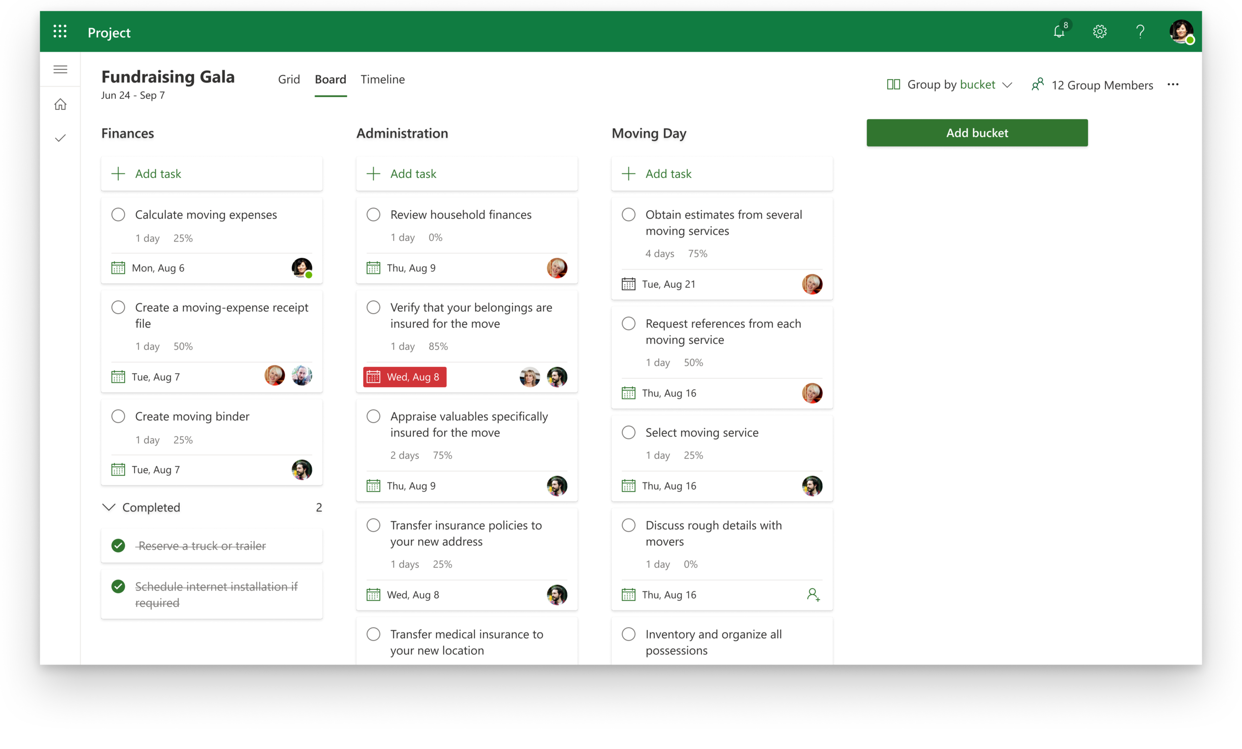
Prioritize people properties on tasks. Transparency is key and everyone feels in the loop.
Timeline architecture
Keeping the canvas simple with a title pane
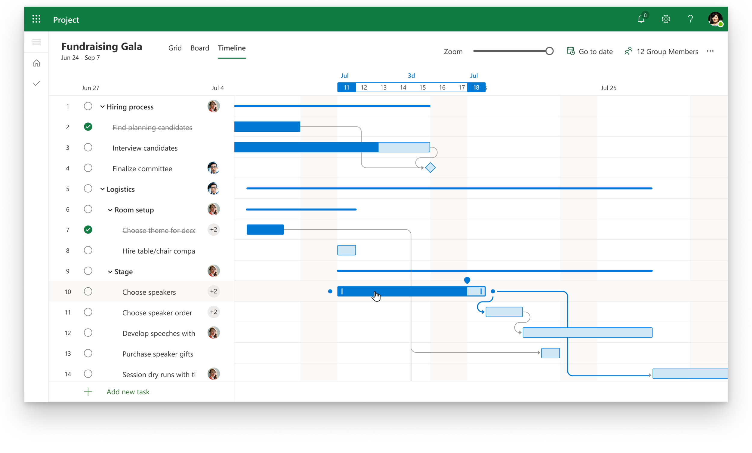
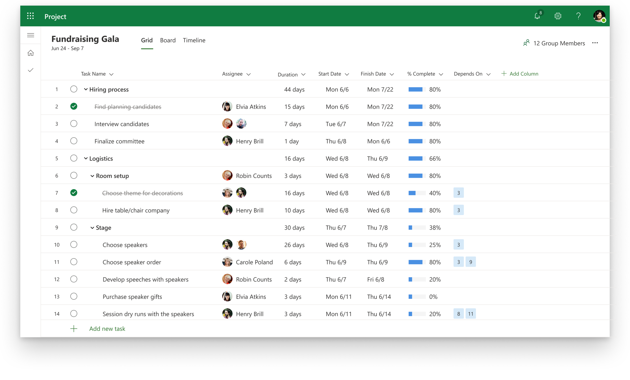
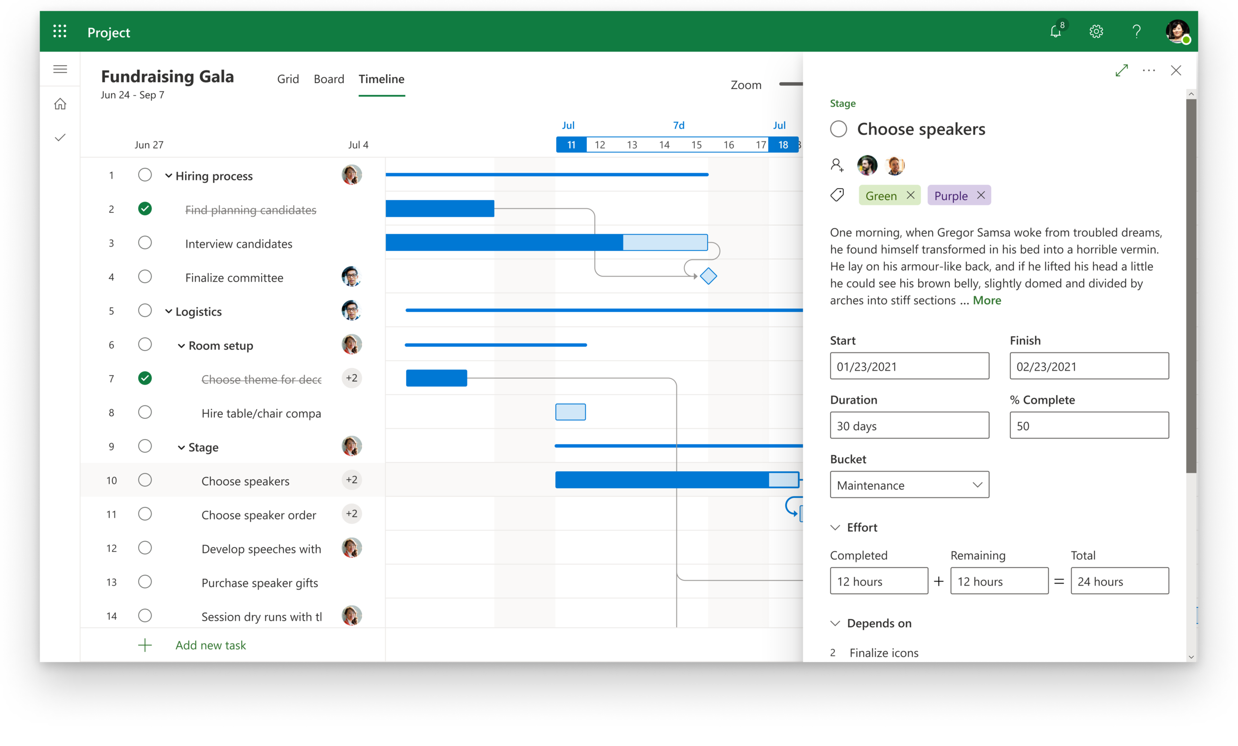
Separating the grid and timeline was a big bet coming from Project Desktop. There was still information that needed to be on the timeline view that couldn’t be converted into visuals: task number, task title, assignee, progress, start/due date, duration, hierarchy and dependencies.
It became clear early on that a title pane was needed to keep the canvas clean. This was an “essentials only” version of the grid where the task title, assignment, and some basic actions lived. It provided a bridge between the grid and timeline, softening the workflow of switching between the two views.
Consolidating date information
While the bars were great at showing duration, the timescale was all the way at the top, and it was still important for customers to know actual dates without having to switch to the grid. After considering callouts on the bars, I decided to lean into the timescale callout. This kept clutter off the canvas, and utilized an area that already focused on dates.
Core components
Bar design
The bars are the building block of the timeline. The bars needed to communicate task duration, progress, color, and dependencies to match existing Project Desktop functionality. The Project Web timeline supports interactivity, so the new bars also needed enough room for interactive touch points. I started off doing visual exercises to explore the best options to show progress and color.
The final bar design was a dark outline with pastel fill. This pattern ensured the bars passed accessibility guidelines in any color, felt substantive enough on the timeline, and had enough solid area for interaction touch points. I sketched out simple timelines with bars of various lengths, progress values and dependency links to test the look of the design as a system.
Bar Interactions
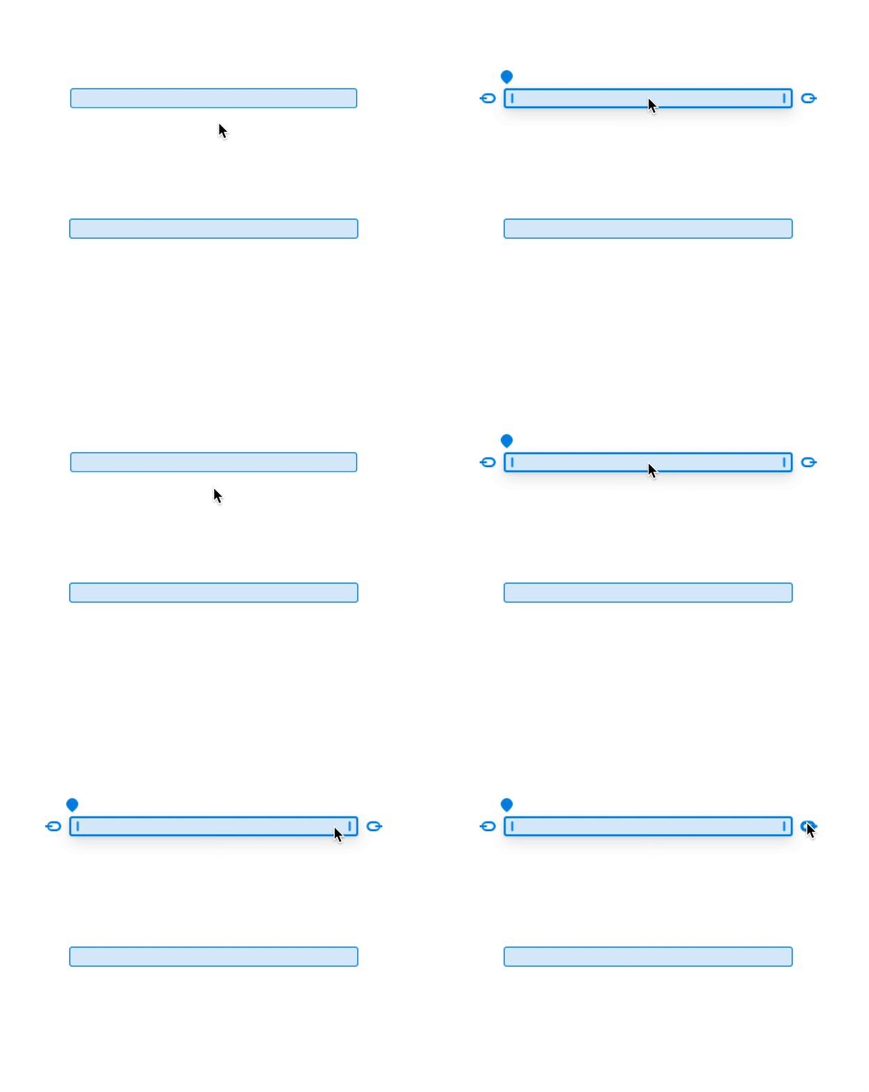
Hover on bar: The bar gets a thicker outline to indicate focus, and icons appear to show users what they can do.
Move bar: The grippy is a universal symbol for “move.” Based on feedback and lack of space, the grippy got cut.
Expand bar: The “notch line” is a common symbol for pane expansion. Hovering over one of the notches also turns the cursor into an expander to emphasize the intent.
Create dependency: A link icon indicates the ability to “link” tasks to create dependencies. Users can click and drag to draw dependencies between tasks.
Update progress: Users can view actual progress percentage by hovering on the teardrop knob, and drag the knob to update right from the timeline.
Timescale highlight
Due dates and duration are two of the most important pieces of task information on the timeline. These dates are displayed as a highlight on the timescale whenever users hover over a bar. The timescale adjusts based on task duration and canvas zoom.
Dependency lines
It was important to show dependencies that were clear while not cluttering the canvas. The lines are the lightest grey possible while still being accessible against white. This system keeps curves as close to their parent bar as possible, maximizes the amount of dependency overlap, and uses geometric patterns to keep things looking clean.
Prototyping Interactions
Between the timescale, bars and dependency lines, there’s a lot of motion on the canvas. Prototyping the interactions was critical to ensuring that customers felt informed and in control, not overwhelmed or confused.
An early prototype to test basic bar move and expand.
An early prototype testing the first iteration of creating a dependency. The link icons weren’t successful in user tests.
Validating and learning with user testing
Test 1: General validation study
A PM partner ran a gut-check study on the new Project Web as a whole. The study was a click-through of slides while asking customers what they expected. The main questions we had:
Overall impressions?
Is it clear what your first step is when you land in a new project?
Does the grid/timeline separation make sense?
Test 2: Timeline UX study
I worked with a prototyping team to build an early version of the timeline to test. They built the canvas in storybook, and I overlaid it on the title pane to mock up a real Project. I moderated individual 30 minute sessions with six customers where I tested interactions with the prototype. The main questions had:
Is it easy to move and expand a bar?
Is it easy to create a dependency?
Do customers know what to expect when a task with dependencies is moved out?
Takeaway 1:
Users felt empowered and in control of their workspace
“I went from not understanding what was going on five minutes ago to now manipulating it and knowing what’s going on.” -C1
Overall impressions were positive. Users liked the look and feel of Project web.
Takeaway 2:
Users wanted more information on the timeline
“It’s very sparse which is clean and easy but maybe I’d want access to more things [like files or notes].” -C1
Action: Make title pane expandable to support long titles. When adding new features to Project Web, always consider their place on the timeline, not just grid.
Takeaway 3:
Dependencies are easy to conceptualize but hard to implement
Every participant understood what a dependency was, but only one person successfully created a link.
Action: Rework the bar interactions to make dependencies easier to create.
Final dependency interaction design
The ball-and-hoop pattern lets users literally draw dependencies between bars on the gantt. Hovering on a ball puts it in the starting hoop, and selecting makes receiver hoops appear wherever a valid dependency can be created. This feedback made it easier for users to understand how to create dependencies. Studies also found that large, geometric touch points were easier to use than something more literal and delicate, like a link icon.
One of the final prototypes for dependency creation.
Working with the team
I sat with engineers throughout most of this process. We iterated through problems together, and I designed with the explicit goal of implementation. They pushed me to be specific with my illustrations, and I learned to pivot quickly based on technical restrictions that came up.
Early prototype of the “small bar” scenario
Challenges + learnings
Taking time to learn pays off
I was onboarding to Microsoft (and working in general) while doing this project. I had so much to learn about the company, the design system, and Project’s history. Giving myself space to do that made the designs much more successful.
Pay attention to what users do, not just what they say
During the testing sessions, it was surprising how much customers would struggle with an action and then not mention it when asked for their thoughts. Actions speak louder than words, and addressing those usability issues was critical in making a better timeline.
Engineering constraints make better designs
It didn’t matter how “cool” my designs were if the page was going to take forever to load. Working with both designers and with engineers helped me find the balance between pushing the boundaries and making sure implementation went smoothly.
Next steps
🔥 Add essential project management features
Custom fields, critical path and schedule management are just a few of the features that customers rely on in Project Desktop. We need to bring those features to Project Web in order for customers to be able to make the switch.
🤝 Make Project a part of the Microsoft ecosystem
The power of Microsoft is in its product ecosystem. Project Web can now integrate into Teams to encourage collaboration, Power BI for complex reporting, Sharepoint for in-context workflows and more. It’s time to say goodbye to the siloed days of Project Desktop and join the online Microsoft suite.
💚 Define relationship to Planner
Now that Project Web targets informal project managers, there’s noticeable overlap in the addressable audiences for Planner and Project. We’ll need to figure out how to help users choose the right product and facilitate the grow-up story from Planner to Project Web.


